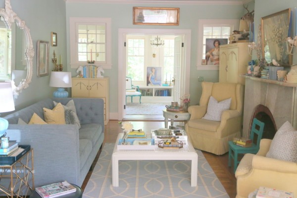
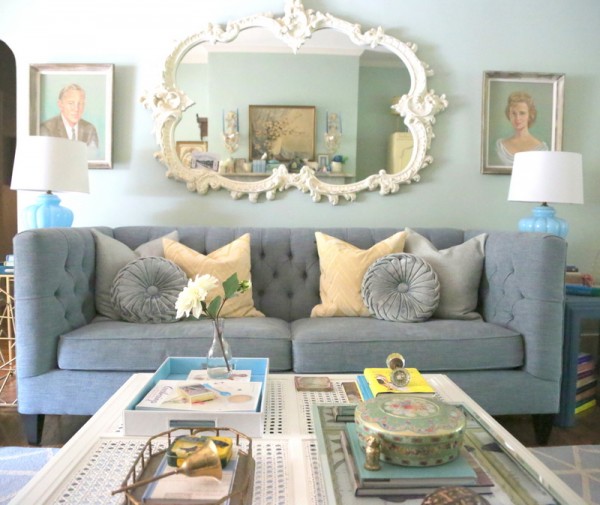
I’m sure I’m not the only one, right? I change up my furniture, art, and accessory arrangement in my living room at least every six months or so. I like things to stay fresh, which means tweaking from time to time. Or you could just call it a serial furniture rearranging disorder. Whatever. This is my living room right now:
For me, my home is my laboratory – I like to experiment without regard to what anyone else might think, welcoming and grouping all the things that I am personally drawn to: color, books, vintage.
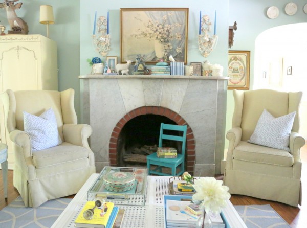
My current color palette in this space is anchored with grayed mint walls – Benjamin Moore’s Prescott Green. This backdrop works well for the butter yellow casegoods and wingback chairs.
Prescott Green also sets off my heather blue sofa from Merridian Home Furnishings that I purchased in the spring. That sofa has got to be one of the best things I’ve ever bought!
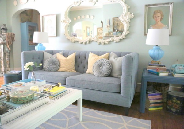
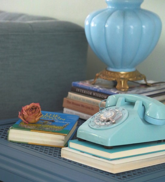
I then used lighter and darker versions of blue throughout. Lighter blues in the rug, pillows, and accessories. Darker, moodier blues in the side table and accessories. Then pops of brighter blues in the table lamps and accessories. This is not a one-note kind of room.
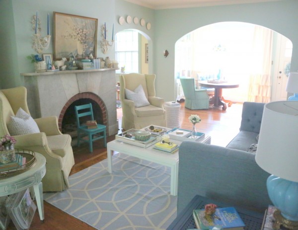
The butter yellows are ramped up with a few spots of brighter yellows – the sofa pillows and a couple of accessories. And greens from light to dark are also scattered throughout.
I am so invigorated and soothed by color at the same time. Living in a color palette like this is extremely personal – not for most people, but it works just right for me.
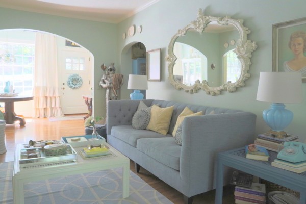
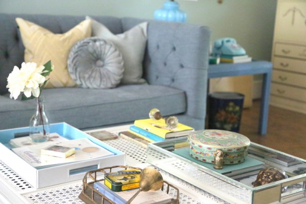
With all the varying shades of blue, yellow, and green in my space, I prefer a warm white as the grounding point on the trim, coffee table, and background color of the rug. Although I often use it in client’s home to ground the space, you’ll notice there is very little black in my living room.
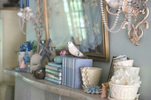
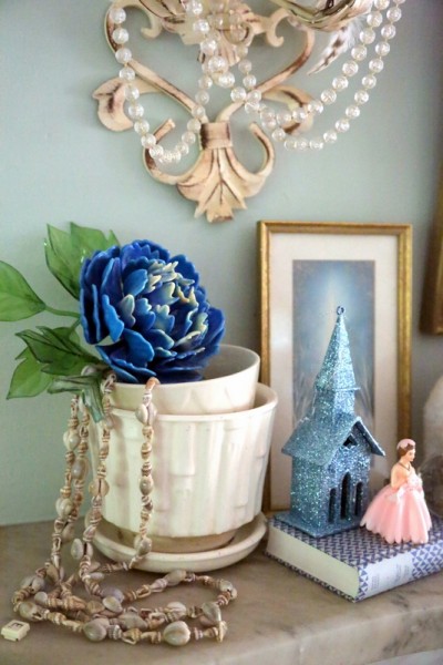
Details are everything for me. They weave together a story, provoke a feeling, and insure a particular experience you have when you spend time in a space. Some might see my accessorizing as organized chaos. And I’m ok with that!
I hope you like the “new” look of my living room. I suspect I’ll keep it (pretty much) this way for awhile, but you never know! My living room is currently in the running for Apartment Therapy’s 2013 Room for Color Contest.
My hope and my request of you is that (if you like the room) you will pop by the contest and “favorite” my living room. It’s also a great opportunity to look around as some other inspirational and colorful rooms that are in the contest. My room falls into the “light” category, but there are also “dark,” “cool,” and “warm” room categories in the tour of rooms you will find there.
Thanks to you that have already voted for me – I’m currently in second place in the “light” color category, but I need some more support to pull ahead. You only have to vote once, and all that is required is an email address (which won’t sign you up for anything else).


It’s absolutely lovely! I’ll vote for ya!
Thank you, Paige! Every vote counts!!!
Your room is a happy room and must bring a smile to your face when you walk in…I like that and am trying to create that type of happiness in my house. I already voted for you..I have learned so much already…Thanks for sharing your knowledge.
Thank you for your vote and for following me here, Brenda!
Your living room is so bright and welcoming! I’ll vote for you!
thank you, heidi!
I voted for you! A beautiful room. I love your color palette. You have wonderful vignettes which I love best. Good luck in the contest!
thank you so much, dear kelly!
Love, love that mirror! Do you have a favorite warm white paint?
Stunning photos. All your colors pop!
Your website has given me chills.. We have so many similar interests from the decorative mantles , to the blue couch (mine is like a periwinkle denim) to the Prescott Green and turquoise . I literally have the same beveled mirror tray on my coffee table with the periwinkle couch in the 2nd parlor. You’ve shown me I’m on the right track but I have so much farther I can go! It made me tear up. When I just saw that tray I knew it was time to write. Our mantles even have the same curves but mine are wood and painted white and yours marble. I started following you on IG a few days ago and decided to take your course when I can get back to work now that we are not “sheltered in place” anymore. I’ve been struggling with color for decades. I even tried starting a small two person color consulting company in Manhattan years ago not knowing anything I just wanted to help others. Unfortunately I had to move the noise was just too much for me but I landed in New Orleans and it’s a much better fit!
I’m paining my front parlor. Last room to redecorate in a 1860’s New Orleans shot gun I rent.
Just a few days ago I plugged in sage green room with turquoise and your page came up and Prescott Green is exactly what I’ve been trying in my front parlor as well as Hollingsworth Green and Tea Light, F&B French Grey. Palladium Blue and Dix Blue and some custom color my neighbors use on the door but I’m a little lost. This room is by far the hardest. Maybe it’s because I have dark bamboos and antiques. Cypress floors. I may have to paint my desk or chair a bright color and buy a bright rug but keep the other pieces dark but every color I paint turns out so drab in daylight . Prescott Green looks great above my mantle that gets a lot of light so I’m going to finish painting it today and see how it turns out. The wall with the front door is south so I used Tea Light on that wall so the color wouldn’t recede and it matches so far. Haven’t finished painting the room yet. I will today. I want it to look classy and bring back it’s original grandeur and charm.
So happy to have found you as a guide. Look forward to taking your course. 🙂
Thank you for sharing all this with me, Bijou! Sounds like we have similar tastes, and a love for vintage. This post is actually from several years ago – if you are following me on IG, you’ve probably seen that I’m restoring a 200-year-old home and moving into it soon. I am using Salisbury Green in several rooms of the house – which is very similar but a bit darker/richer than Prescott Green (which is still one of my favorites). I’d love to see your newly painted room when you are finished!