I’ve been following color trends for a living for more than a decade. I study them, report them, and specify them for my clients. I’ve used color trends to develop training and provide advice for professional designers, stagers, Realtors, and homeowners in regard to which paint colors have the most appeal and the longest shelf life.
And here’s the cold, hard truth: so-called Colors of the Year has about 5% impact on the paint colors I specify. Let me try to explain why they aren’t such a big deal afterall.
You see, I’ve been trying to make sense of the Color of the Year since I started covering them on this blog years ago. Pantone has always claimed to be the great diviner, or predictor, of the latest color trends. The paint color companies have jumped on that bandwagon, and wisely so, because it seems like everyone is interested in the Color of the Year! Know why? Because 85% of consumer decision-making is based on COLOR.
But do you know what’s really interesting? With all the great color knowledge and insight these paint companies possess, they each come up with a completely different color from each other,
every. stinking. year.
Let’s take a look-see at this year’s big Colors of the Year:
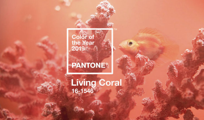
Pantone, the Big King O’ Color, chose Living Coral. The PR photo is simply lovely:
While NPR opines about the deeper hidden meaning and possible ironies of such a choice for 2019 Color of the Year:
“The word ‘coral’ doesn’t often get the opportunity to be paired with ‘living.’ It’s ‘dying’ that gets that distinction more often than not, as report after report reveal the alarming extent to which human actions have played a role in bleaching and killing coral reefs around the world . . . A dark irony lurks in the fact that Pantone announced its honors for Living Coral on the same day climate scientists revealed that global carbon emissions are climbing . . .
. . . the rest of us who make our living specifying color every day have to figure out how to answer our clients who want to know how these Colors of the Year will impact the choices they make in their homes.
Back to Pantone’s 2019 Color of the Year: despite that lovely image shown above, the true color actually looks like this:
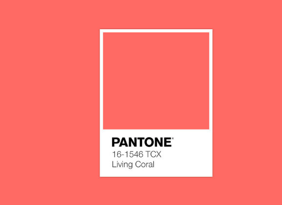
Yikes. That’s a bit more vivid than is palatable in most real-life situations. If we see a translation in retail fashion or on the walls of residential homes, it’s gonna have to mute down quite a bit.
But WAIT. Let’s don’t get this confused with Sherwin-Williams 2015 Color of the Year, Coral Reef!
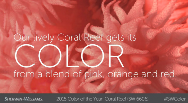
Pantone’s 2019 Color of the Year and Sherwin-Williams 2015 Color of the Year seems to be about the same color, right?
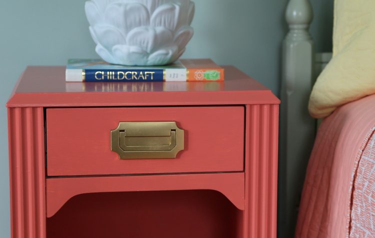
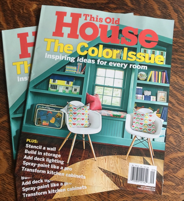
I have yet to see a wall painted in Coral Reef, in spite of Sherwin-Williams’ prediction in 2014. However, I used this pretty color for side tables in my daughter’s bedroom in 2015, which actually made the cover of This Old House Magazine!
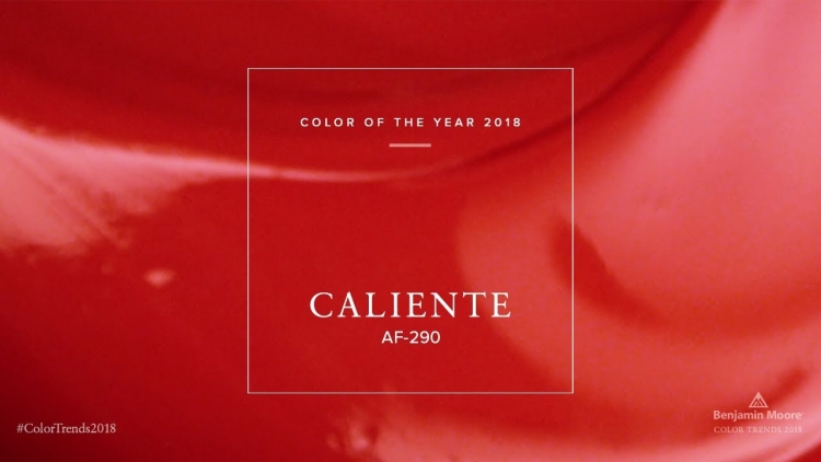
Wow, did Sherwin-Williams actually predict Pantone’s pick four years in advance??? If that’s true, this is what we may have to look forward to in the year 2023 since the Sherwin-Williams 2019 Color of the Year is this color:
Benjamin Moore chose Metropolitan for 2019, and it is perfectly lovely!
 Benjamin Moore Metropolitan
But is it predictive? Uh, no. It’s more reflective, since this kind of light gray has been trending for years now, Here’s a room where I used a similar color in 2015:
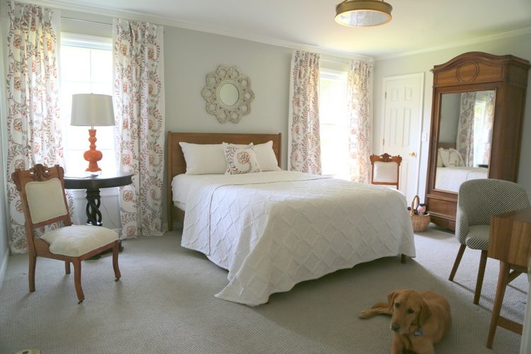 2015 guest room design by The Decorologist
Good job, Ben, this was definitely better than your 2018 prediction that went nowhere. I mean, did you see this color on walls and furnishings in 2018?
And while we are talking about color prediction fails, how about Pantone’s 2018 Color of the Year:
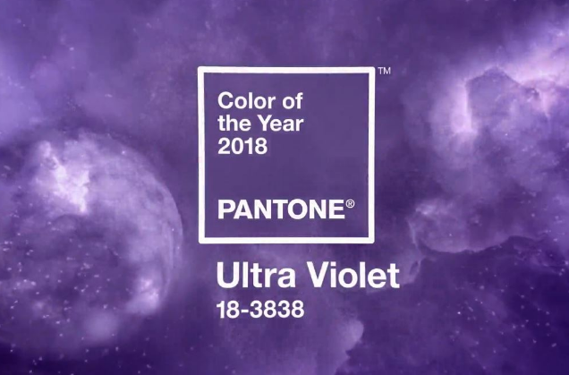
I’m not saying you never saw this in retail, but it certainly wasn’t a big hit in design or paint colors in 2018. Moving on . . .
Behr got closer with it’s pick for 2019:
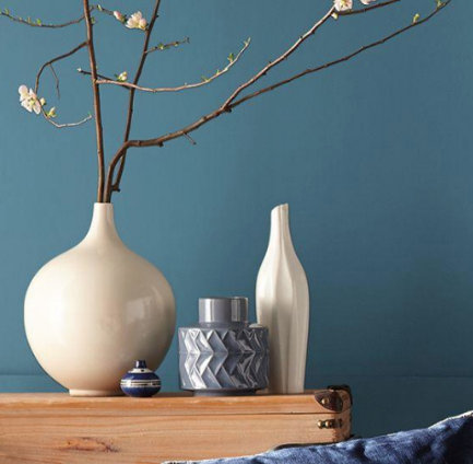 Behr Blueprint
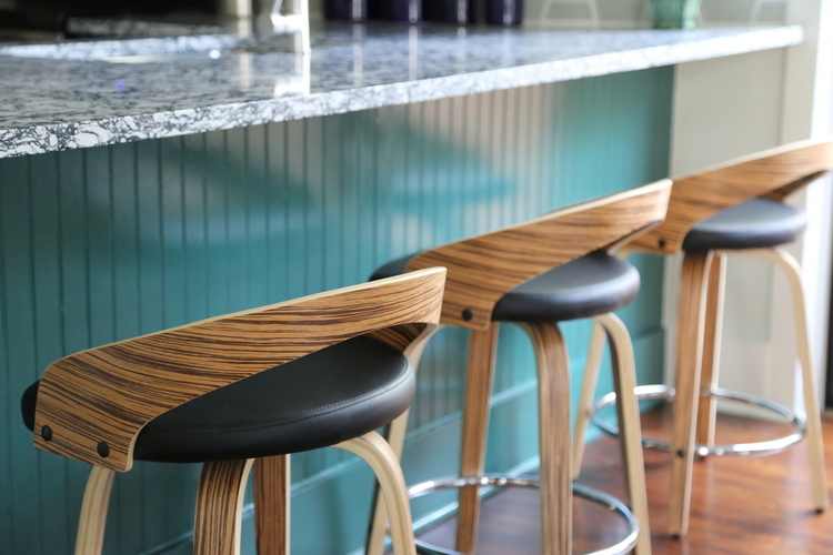
It’s a gorgeous color, but it was a reflective choice since this hue has been hot-hot-hot for a few years. It would have been a perfect pick for 2017 Color of the Year. I used a similar blue in a farmhouse kitchen last year, and we’ll continue to see this pretty color in paint and design:
 design by The Decorologist, Melanie G Photography
Which company made the *BEST* choice for 2019 Color of the Year??? In my mind, PPG is the winner with its pick of Night Watch:
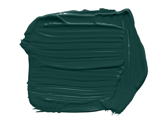 Dark greens have been all over design markets this year and last year, and it’s a color you actually see people exciting about using in their homes:
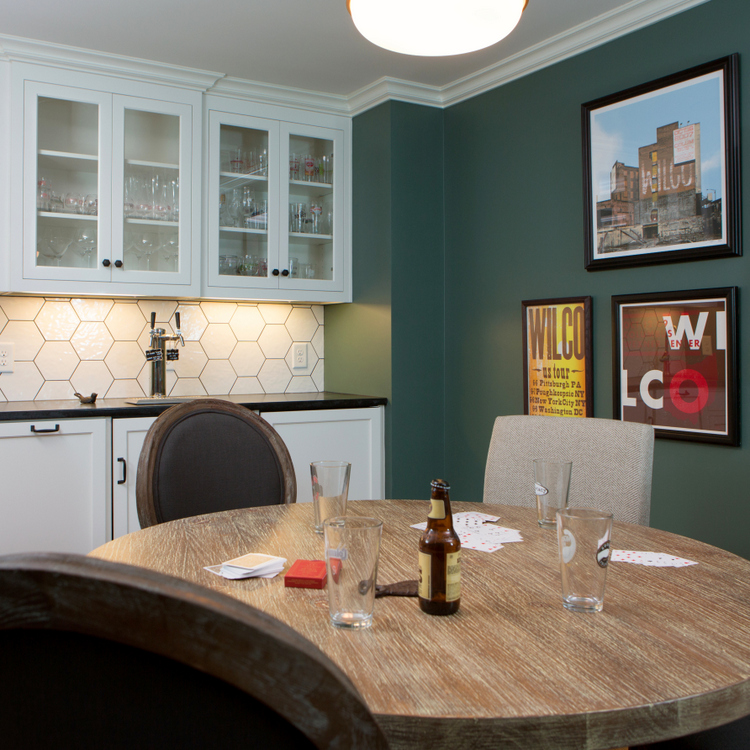 2017 game room design by The Decorologist
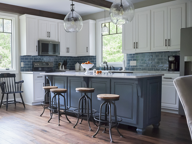
 2018 kitchen design by The Decorologist
But since I’m being super-critical in this blogpost, for a Color of the Year to be truly predictive, PPG’s pick would have been a better choice for 2018 Color of the Year.
Paint companies are out to market what they sell – paint. I don’t blame them for using the Color of the Year as a marketing tool. It gets a lot of attention and press every year, but can we all just admit that there is nothing predictive about it? If it were, why would all the companies come up with such vastly different Colors of the Year?
If you want to find out about the trends in paint colors and interior design, the best places to look are to design bloggers who are in the field and keeping up with semi-annual design markets like High Point.
I don’t believe ANY of the companies are doing any kind of valid prediction. At best, paint companies are a little behind of what’s trending in residential paint colors and they are simply naming colors that are reflective of what’s already going on. At their most ambitious, they are attempting to shape the trends, which is what I believe Pantone is attempting to do. But mostly, I think they are going into a back conference room somewhere and arguing with one another until someone finally takes a dart and throws it at a bunch of random colors and sees what pops:
So even if you see manufacturers begin designing dresses and putting out furniture lines in Pantone’s 2019 Color of the Year, it may be because they are blindly trusting that Pantone’s picks are predictive. If anything, they may be shaping consumer choices, when Pantone actually chooses a pretty color. But mostly, if I’ve learned anything over the last ten years, it’s that Colors of the Years have been more duds than studs. Time will tell if Pantone can spawn a color trend in the coming year.
I can’t wait to hear what you think about all the 2019 Colors of the Year!
By the way, I was just notified that The Decorologist blog was named #32 in Feedspot’s Top 100 Interior Design Blogs out of the 100,000 influential bloggers in its database! Thanks to my long-time readers – I wouldn’t still be writing if it wasn’t for your support, which means so much to me.
Registration is open for our RESA-accredited Expert Psychological Stager™ training March 5-7, 2020 in beautiful Nashville, TN. I’d love to see you there! Find out more here.
xo Kristie


Oh my! I hate coral!
That’s ok. I’m sure to save some money somewhere down the line! 🙂
No worries, Rhonda. There will be lots of gorgeous greens, blues, and golds in the stores!
Kristie
I think that the real purpose of COY is PR. It gets us talking about the paint companies 🙂
Absolutely, Maggie! And here we are, talking! ;p
I love your use of the dark blue and dark green, but yeah, their colors have nothing to do with real life most of the time.
Congratulations on your achievement!
Thank you so much, Beth!
Kristie, why don’t you do your own pick of color of the year in Pantone, BM, and Sherwin Williams? I bet you’d come up with something on trend but LIVABLE! 🙂
Susan,
Very interesting! Hmmm, let me chew on that one for a bit. Thanks for posing that challenge!
I second this! You have such a great feel for colors and how to use them. Heck, you could even pick two — one major color (a nice livable color you could paint in a real house) and an accent color. Anyone can throw a dart at a color board, but it takes a true professional to know when and where to use a color, how to pair it with other colors, and also when to avoid it!
Thank you so much, Jessica! I appreciate you sharing 🙂
I agree with you completely. PPG’s choice is much more interesting than the others. Not that I can’t appreciate Living Coral, but I would not consider it for a whole wall, let alone a whole room. Good accent color, but not a main color for many people.
Yeah, Living Coral is a fine color – but I don’t see it being the “it” color for 2019.
Well, I have to say that successfully using the coral color should really be for accent, as it still tends to look like “Pepto-Bismal Pink.” LOL! Reminds me of the 80’s when the color rose was so popular. Yet, it STILL looked like Pepto-Bismal Pink. LOL.
The color trends I see happening are french blue, as it will accent beautifully with the grey tones so prevalent right now and I believe the green shade will take us out of the grays within three years. That’s my thought(s). :~)
Thank you so much for sharing your thoughts, Keri! Definitely need to keep the coral as an accent only, right?
There are no “wrong” colors, just wrong color applications. Love your blog!!
Gina, thank you! I often say something similar: there are no dated colors, just dated color combinations!
Love the dark green. It’s a wonderful color to paint a dining room if you have art on the walls. It looks sophisticated and makes everything else pop. Coral, not so much. It looks nice in Florida, and reminds me of my MIL’s living room there, which is lovely, but dated. Thanks for posting this article, it was fun to read.
Thank you for sharing, Melissa. My office is currently dark emerald green, and it is so enchanting and sophisticated. You are right – it is gorgeous in a dining room!
I love coral because I love all the watery aquas and soft greens and creams. These are colors I wear and decorate my home in. While I’m a fan, it doesn’t matter, because I’ll be wearing them forever!
I love that Blueprint and the dark green, for someone, somewhere else. Best we have so many colors to choose from.
Joey,
Color is such a part of personality, isn’t it? We are all drawn to certain “special” colors that feel like they are a part of us!
OMG Sherwin Williams has jumped the shark!
Haha, you are hilarious!
I have been looking at adding some hints of coral in my house, but I am NOT a trend-setter. Things have to be pretty mainstream before I even give them a second thought. So… coral (in accessories – not accent walls) has been popular for a while now. Nothing exciting about the color of the year choice from Pantone, if you ask me. I’m with you. It’s all hype and has very little to do with what is (or will be) popular. They accomplished their goal, though. I’m here thinking and talking about Pantone, a company that I would have no idea even existed if it weren’t for their Color of the Year.
Yes! Very few people had ever heard of Pantone until they introduced the “Color of the Year” in 2007. It has been a HUGE marketing success for them and for all the paint companies that have jumped on the bandwagon since then!
Well shoot. I was going tp paint part of my bathroom in cavern clay. I hate to think I’m stuck in 1998. 😀
But I did paint my dining room dark Peale green in 2016. So maybe I’m ahead of my time?
I don’t think any color should go out of style. Paint what you love and just ignore those colors of the year. Or write a good blog post on them. 😀
Yes, Carol – ahead of your time! 🙂 I’m sure your dining room looks beautiful. I’m with you – colors don’t go out of style. But sometimes color combinations do! For example, Harvest Gold + Avocado Green looks so 1970s, but Avocado Green and Navy looks pretty chic, right? So yes, paint the colors you love – EXCEPT when you are about to put your home on the market! That’s when you need to think of the buyers’ tastes and not your own. Have a great weekend!
COY or Trends aren’t as important to me as what speaks to my inner feelings/response when selecting color. Course I’d like everyone to love it but, I’m the one I’m selecting for. Guess it’s a type of “listen to your heartstrings” for me.
I feel that way, too, Judy – in my personal home. It’s when I work for clients who want to be sure their colors and finishes look “current” for the longest time possible that I have to be mindful of trends. Most people come to me when they want to “update,” which means I’m supposed to help them be on the cutting edge. 😉
A few days ago I happened to be reminded of Pantone’s controversial color of the year in 2015, Marsala , when I was shopping for some new hats and gloves–I saw lots of them in that color, LOL! I wonder if the color of the year influences the fashion industry, but just takes a few years to actually get it into design and production?
Anyway–I think the Sherwin Williams color of the year, cavern clay, is great–if you want to feel like you live in an actual cave–Yuck! I agree, the Night Watch is a great color of the year. I am seeing that shade or similar of green everywhere, but I think it might look better on a sofa or chair ( or maybe a front door) than on a wall, imho.
Phyllis,
While oxblood has been trending for a few years in fashion, it is doubtful that one will trickle down to home decor anytime soon! Thank you for sharing your thoughts! 🙂
Hi Kristie ~
Thank you for a post that actually explains that these * Color Of The Year* choices are actually content marketing and PR vehicles for the paint companies. Every company needs something that gets consumers and homeowners talking about it…and whomever thought of the original *Color Of The Year* idea deserves a gold medal for a great marketing idea.
The one company whose prediction I actually listen to is PANTONE, as paint isn’t their primary business, and they heavily research their choice. Personally, I really like this year’s selection, it feels uplifting to me and it makes me happy.
The way you used it as an accent on a nightstand (when SW selected a similar color) was so perfect – and congrats on it making the cover of This Old House magazine back when you did use it!
I agree with your friend, above, though, you should name your Color Of The Year for residential design and let everyone talk about that, since you are a color expert working with colors in people’s homes every day!
All great points Kristie! TBH, I’m always more interested in seeing everyone’s responses than actually seeing the color!
Great article Kristie, and bang on. I love your edgy honesty!
Thank you, Sheila! Hope you are doing well – have a wonderful holiday season!
Hi Kristie,
My husband and I just completed your online workshop about choosing color. (I get props for convincing my husband to watch too, right?!). We are completely redecorating our downstairs, as it was destroyed by the flooding with Hurricane Florence. Since we are basically starting from scratch (except for the 3-month old, living room rug that Overstock replaced for me for FREE when they heard about our situation—bless them), we want to avoid rookie mistakes when choosing paint color, tile, etc. for our open floor plan. We gained a lot of confidence from watching your workshop. Totally worth the $59 investment. One question we were left with was if you have a blog post of your current favorite colors, seeing that the workshop was from 2012? We’ll be checking out Joanna Gaines’ colors, but would love your input too! Any other suggestions? Thanks!
I like to think of these colors of the year as suggestions to buy a throw pillow, a vase, a blouse. I focus on occupied stagings so neutral is easier to sell than an intense color.
Smart thinking, Amanda! These colors are good for inspiration – for taking a chance on a “trending” color, but in small doses! 😉
Hi Kristie, I’m in Australia & if you want to get confused try following trends here!!!😲😵 My hubby & I am renovating, restoring & reliving a 1930’s weatherboard farmhouse with the worst extension ever!! But at least the toilet & shower are inside, don’t ask any other questions. The whole 5 acres needs work & love, so we started with the bones & engineering, we don’t have cash so slow, steady, lots of research & hard labour. We’ve done everything ourselves picking reclaimed, recycled really good finds & spending cash on solid long-term stuff. We want this home to be here a long time (her name is Sara Smiles by the way), what I have found is a gradual process in decorating her, the house I thought was going to be white with bunswick green trim & rust red roof has become three shades of yellow with white trim & a silver metal roof! My bedroom has changed rooms with the sunroom attached to it & has gone two very pretty shades of pink with white trim (I am not a pink person). So the point? Sometimes it is easy to picture a concept and complete it other times especially when you live & love your home, the house can lead you & you need to listen not just go with what’s the trend! Oh & I do take before, after & during pics! By the way the tile info is exactly what I was looking for, so confusing!!!! Thanks Betsy😁