Home has never been more important, and this is the year to make it your own. Whether you want to surround yourself with peace and calm or create a unique wonderland for your imagination, new paint color is the most transformative tool available! To get your new year started right, I’m sharing some beautiful paint colors for 2022 featured by Ballard Designs (who happen to have a great sale going on now).
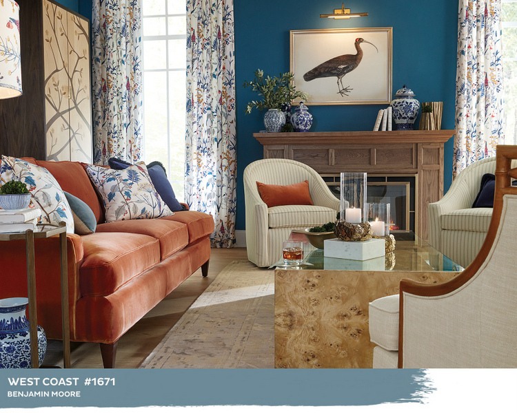
Darker blues pair beautifully with warm orange. If you love copper, amber, cinnamon, or pumpkin accents, a medium to dark blue wall color might be a good option for you.
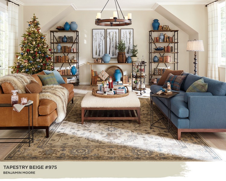
If you prefer a “safe” neutral, a light warm beige is a nice backdrop for orange and blue tones. Benjamin Moore Tapestry Beige is warmer than white and lighter than the darker beiges that we’ve been moving away from in recent years.
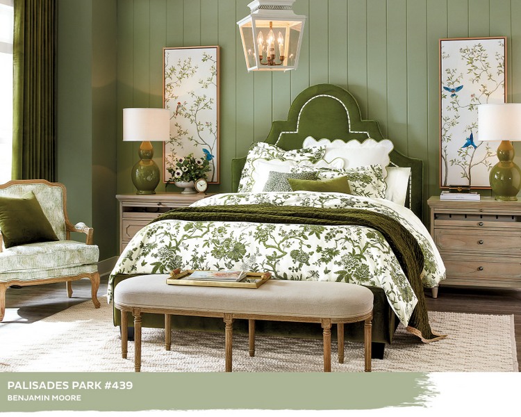
Most all the paint color companies chose green as their 2022 Color of the Year, and here’s a lovely one to consider – Benjamin Moore Palisades Park:
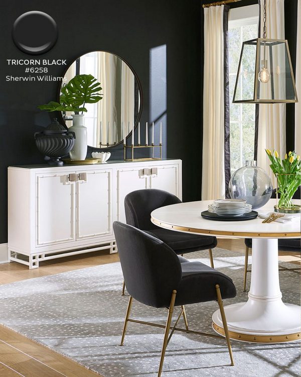
Maybe you have a room where you want to create moody drama? Ballard Designs featured one of my favorite blacks, Sherwin-Williams Tricorn Black, in this dining room:
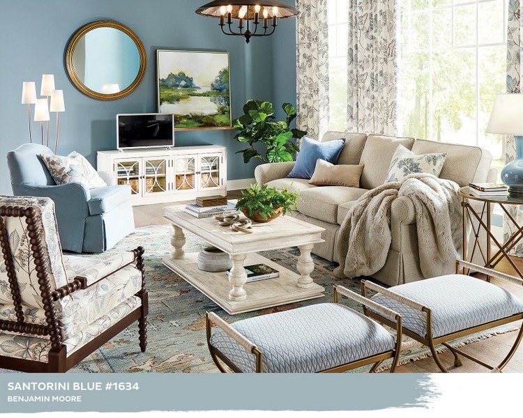
Another pretty option is Benjamin Moore Santorini Blue – I’ve used it a number of times in boys’ and young men’s bedrooms:
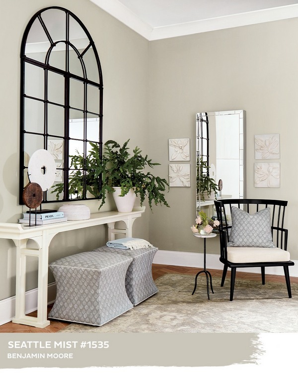
Benjamin Moore’s Seattle Mist is a fantastic light neutral with a slight green undertone. Between a beige and gray, it’s one I’ve used frequently in clients’ homes. FYI, it typically reads a bit lighter than it does in this image from Ballard Designs:
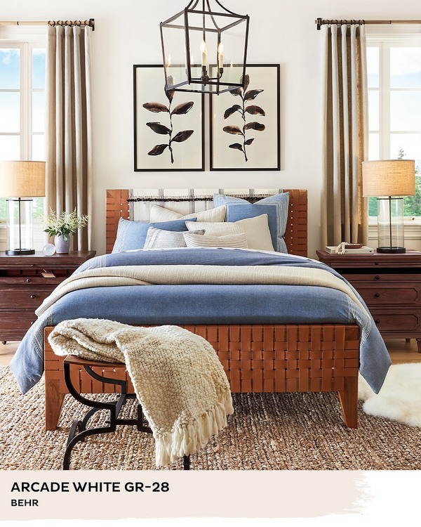
I don’t specify Behr colors, but this white looks lovely in this bedroom. However, you should be wary of catalog, magazine, and computer images of paint colors (here’s why). Be sure and test paint colors prior to choosing the best option for your unique space. I wrote about how to do that here. My favorite way to sample is to brush real paint on Small Wall paint sample boards, which give you the best representation of how the color will look in real life in your space. You can find those at Sherwin-Williams retailers or online here.
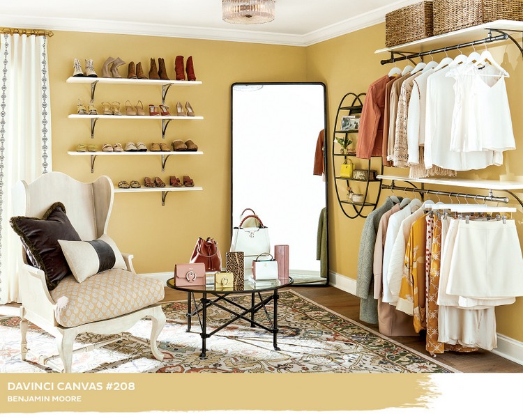
Ballard Designs featured this yellow gold paint color in a very spacious closet, but I don’t believe most of us are ready to welcome yellow gold back into our homes. Many of my clients are still trying to rid their walls of this color from the 1990s. Maybe next decade this will be appealing again??
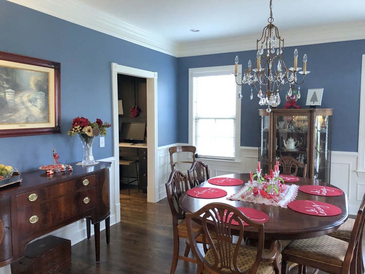
Benjamin Moore Philipsburg Blue is a classic beauty from their Historic Collection:
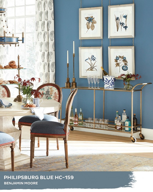
It reads a little darker in real life than it does in Ballard’s image. I recently specified it for a neighbor’s dining room – here’s a quick iphone photo of the color:
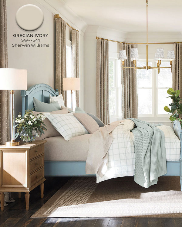
Warm whites are still trending, and Ballard Designs features Sherwin-Williams Grecian Ivory here:
Are you ready for a new paint color or two (or ten) in your home in 2022? Let us know what you are pondering in the comments below! Pin this image to save these color ideas for later:
 Train with me to be a Paint Color Consultant!


What a great posting! . . . Thank you!
Thank you, Lily – I hope you are doing well! Happy New Year!
Hi Kristie, I’m always so happy to see an update from you in my inbox! What a timely article. Earlier today I saw the Ballard Design post and bookmarked some of the colors, and your comments are very helpful, especially regarding Seattle Mist. Thank you!
All the best wishes for a happy and healthy 2022!
Awesome, thank you so much! All the best to you and yours in the new year!
Unable to pin
That’s strange. I went in and was able to pin – I wonder if anyone else is having problems pinning?
Oddly, I wasn’t able to pin either…and this is an article worth pinning!
I’m glad to see green come back after a very long absence.
Yes, lots of lovely greens to choose from!
Painting my handrail and newel post Tricorn Black as soon as my boys go back to school in January!
Perfect! That is a great update, well worth the effort. 🙂
With a hue angle of 95 degrees, Seattle Mist is a member of the Yellow hue family. It doesn’t have a “green undertone”. Architectural paint doesn’t have undertones. Every color except pure white, gray or black belongs to a hue family.
Sandy, I’m curious if you’ve personally used Seattle Mist and seen it appear the slightest bit yellow on the walls for you? I have specified it many dozens of times, and it appears to be in the green hue family every time. Does the Ballard image appear to be in the yellow hue family to you?
Hi there Kristie, changing from different colors on the walls to one color throughout is something I’m looking forward to doing. However, I would like to go with the soft green in the big kitchen, up the stairs and into the bonus room. It’s been seven years now and I’m ready for a change, what do you think? Marcy
Marcy, that sounds lovely! Maybe you could do a soft green in those spaces, but a more neutralized version of that color in the entry, living rooms, dining room, and other halls. Then, what about an accent color for the dining room ceiling?
Lovely photos in this post (well maybe the yellow-gold worries me a bit, b/c I’m old enough to remember the 70s – also b/c the hall bath in my last house was still tiled ‘harvest gold’). The creamy tans are looking good, aren’t they? I love the room with the blue pottery.
Thank you, Sandy! I agree that the yellow-gold isn’t going to be very popular with many of us for awhile, at least not for wall color.
As usual, your comments are timely and on point! Love the Philipsburg Blue, might try it on an exterior door instead of my stand by blue, Hale Navy. Have a Happy New Year!
Philipsburg Blue is a great choice, Nancy! Happy New Year to you, as well.
These are gorgeous (except for maybe that closet, ha)! My living room has navy, cognac/rust, with rust in the fireplace, red in the cabinetry and yellowish in the wood floors. Drives me crazy, but I’m trying!
What is the color on recent Ballards catalogue