I recently attended Benjamin Moore‘s 2020 Color Forecast event in Nashville. Presented by my regional designer rep, Candice Carter, at the House Beautiful Whole Home Concept House, the lecture was about the history of paint color in residential settings. As a devoted lover of old homes (and great paint colors!), I was completely thrilled to be present at this event.
Candice explained that the general mood of the culture has great influence on color trends. She graciously allowed me to use some of her slides to share this interesting information with my readers!
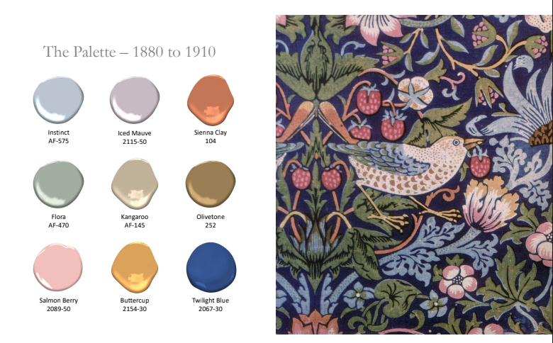
1880-1910 The Paint Colors
These are the years of the second Industrial Revolution. House Beautiful magazine begins publication, and the Arts and Crafts movement pushes back against the Victorian era of decorating. Interior decorating becomes an actual profession, with early influencers including Edith Wharton and Elsie De Wolfe. William Morris’ fabric and wallpaper designs feature organic patterns and nature themes, like the one below:
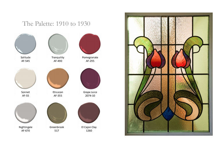
1910-1930 The Paint Colors
World War I, the Roaring 20s, and the stock market crash dominate this era. The proliferation of cars, movies, radio programs, and jazz music influence culture. Art Deco and Style Moderne emerge, with buildings being erected of glass, steel, and concrete. The Bauhaus movement in Germany influences American building and design, and heavy-hitter influencers include Frank Lloyd Wright and Walter Gropius.
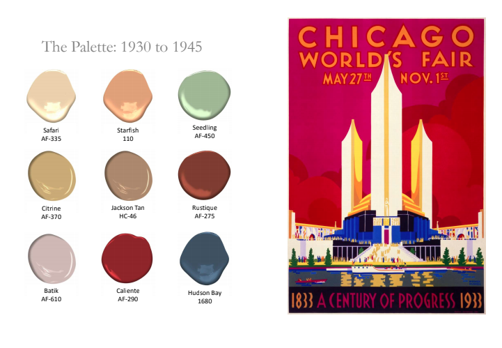
1930-1945 The Paint Colors
This era ushered in the New Deal and World War II. Women began entering the workforce, as the men were at war. Out of necessity, things were more streamlined and practical. Depression glass had an impact on the hues of interiors, where “safe” colors were being chosen. In contrast to these more reserved interiors, Dorothy Draper’s bold colors and designs provided a hope that good times would come again . . .
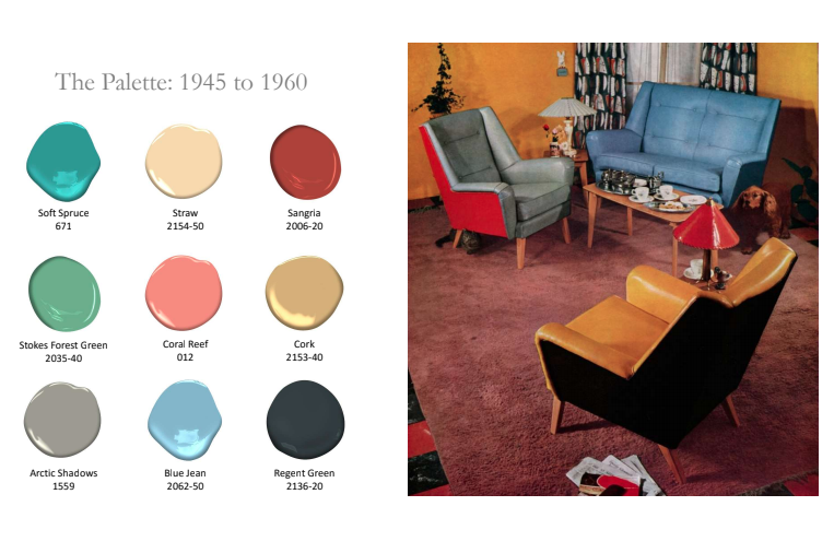
1945-1960 The Paint Colors
This is the postwar era, when hope does return. Indoor/outdoor spaces gain emphasis in residential buildings, and material innovations are popping up like linoleum, stainless steel, plywood, and plastics. Design is more functional and attainable by the general public. Colors becomes brighter with Scandinavian influence, shapes are organic, and America is patriotic. Design influencers include Eero Saarinen and Charles & Ray Eames.
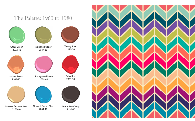
 1960 to 1980 The Paint Colors
This is the era of the Vietnam War, the moon landing, the Civil Rights Movement, and big changes in music. Travel becomes a popular pastime, psychodelia is a thing, and decadent, lavish design prevails. I read an article recently calling the 70s “The Decade that Taste Forgot.” Who can forget the shag carpet?? Bold abstract patterns become more prevalent, and materials like lucite, metal, wood, wicker, and rattan show up in home decor. Design influencers include luxe designers like David Hicks.
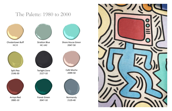
1980 to 2000 The Paint Colors
Reagan-Bush, the Persian Gulf War, and the Clintons dominate the news. This era is marked by materialism, mass construction, and McMansions. Popular fashion and interior design styles include preppy and country, and Ralph Lauren and Laura Ashley are the rage. MTV is born and Al Gore invents the internet (sorry, couldn’t resist). Faux finishes gain popularity and nature-focused colors are big.
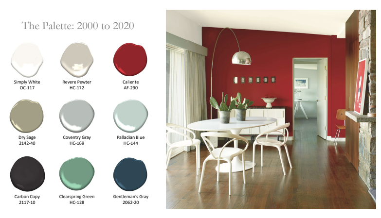
2000-2020 The Paint Colors
Ah, the New Millennium and Y2K! This era is all about technology, communication, and the environment. The recession, terrorism, and 9/11 impact our sense of security. Social media booms with influencers that impact design through blogs, pinterest, and instagram. We move from warmer palettes to cooler ones, with result in the rise of gray colors, tinted neutrals, and deeper hues.
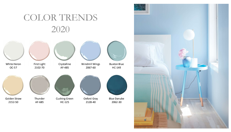
2020 and Beyond – Now What?
Benjamin Moore predicts that this new era will be marked by increased focus on imagination, community, authenticity, beauty, comfort, privacy, optimism, and self-expression. The color palette for 2020 contains fresh, light tints and dark, contrasting shades.
If social unrest is associated with muted colors, and optimism is associated with bright, upbeat colors, it looks as though Benjamin Moore predicts a more positive era to come. I hope you enjoyed this little trip through the history of paint color. Please share which era is YOUR favorite in the comments below!
If paint color fascinates you like it does me, there is SO MUCH TO LEARN about how to use it in your home and the homes of your clients. Let me rock your world with color in my new ONLINE color course – and be sure to check out all the 5-star reviews!!!


Fascinating! I love history and I love color and design. Putting the two together is great. But, where is the palette for 1910-1930? My house was built in that time frame and I’d love to see what colors were most popular during those decades.
OOPS!!! Thank you so much for catching my error – I just went back in and added the 1910-1930 color palettes, Molly! Sorry about that 😉
Some lovely colors in that set, especially in the blue-gray family!
Kristie, absolutely love historical pieces like this one! Good refresher on perspectives of the time. Glad to see rosy future. Well done and thanks!
Thank you so much, Rhonda! This one was fun for me 🙂
You had me at William Morris. Too bad there isn’t really a place for Morris prints in our homes just now. I have to be happy with a scarf. As for the rest, I love it all — except — isn’t your lecturer forgetting that Charles and Ray Eames were a design team? Another “too bad” – women are often overlooked.
Sandy,
Good call – I think I’ll go edit the post to include both on the Eames team!!! I am a HUGE fan of William Morris, too!
I love this post! It really underscores for me how much I really really disliked the design trends from the 80’s (when I was born) to more recent times. It’s only been in the last handful of years that I actually like what I see when I walk into home decor stores. Apparently it wasn’t in my head that I disliked everything I saw now that I can see it in an overview like this! I am also struck by how even though I love the color palettes of other times arrangement really makes a difference. I love the colors of the 45-60’s for example. But feel agahast when I look at the picture of the interior. It’s remarkable to me how context of color can really change everything.
You are so right, Kira, about how color can really change everything! I think it’s fascinating how different people are drawn to different colors and styles, and how tied those feelings can be to their personal experiences, childhood, etc. Thank you for sharing your thoughts and insights here. 🙂
I’m kind of loving the palette of 1880-1910! But I have to admit, I’m also loving 2020. Great blog post, Kristie! The history of design fascinates me 🙂 I wish the speaker touched upon Victorians though, “where more is more!” lol I’ve always been drawn to Victorians.
The presentation started right AFTER the Victorian age! I also really liked that 1880-1910 era – I am a big fan of William Morris. I visited one of his homes, Kelmscott Manor, in the Cotswolds outside of London two years ago. It was so wonderful!!!
Kristie, I can imagine how excited you were to attend this lecture! It right up several of your allies!
I’ll bet you will incorporate this in one of your classes soon!
Candice was kind to share these slides with you, as well.
I enjoyed it too!
So…… what do you think of some of the 2020 colors?
♥️Paula
Love color theory/history and seeing how cultural and societal trends impact design. Thanks!
You are welcome, Keri! Thank you for following the blog!
Kristie – such a great trip through the history of popular colors as they relate to the events of the times!
Thank you, Linda! This one was fun to write!
Love seeing the history and the color palettes associated with these periods of time.
I have always been fascinated with how culture and history influences design – this is such a great overview and fun to see the color associations laid out by time period. Great post!
You had me at 2020. I’m all about the light and bright.
Wow such an interesting article and great to know the palettes of bygone days in case you want to recreate a look. I think I like the 2020 palette best of all!
Kristi:
I love posts where I really learn something… thanks for this one. I enjoyed seeing the historical progression of paint colors, because historical progression adds context.
And my favorite era is the one we are going into right now: 2020. That deep blue green is speaking my name… but so are the lighter, fresher more optimistic colors.
Really cool! I laughed out loud at “the decade that taste forgot”! Hahhaaa
Kristie,
Whoa! Thank you so much for sharing this history! There isn’t a color I don’t like, but the bold palette – 1960-1980 – speaks to me! (…no taste I guess 🤣) I think every design should have an intentional splash of bold color to remind us we’re ALIVE. I’m trying to convince my better half that two “clearest ocean blue” metal and wood etagere bookshelves will BAM!! our muted space!
I hope you convinced him as it sounds gorgeous to me !!
This was such a fun trip! I really enjoyed reading the history and walking through the eras.
Really interested blog post. Thanks so much for sharing. Love the bold 1960-80 color palette!
Very interesting condensed color history in the US. I wonder why we were influenced by Scandinavian design?
That’s a good question. Maybe because it (Scandinavian craze) coincided with manufactured furniture rather than hand-made?
What… No gold in the 2000-2020 palette? Where is the “Tuscan trend”? Overall, I don’t agree with these color palettes as true representations of each era. The 60’s were far more nuanced than that as were the 70’s, 80’s, 90’s… maybe I’ll write my own History of Color post.
Thank you for sharing.
This was an awesome read! How interesting! ❤️❤️❤️ Thank you!
Found on marketplace thought I would share. Dont know when it was made.
Oh wow, that is cool! 🙂
What a fascinating journey through the evolution of color! I loved learning about how different historical events influenced paint palettes. It’s incredible to see how Benjamin Moore has captured those moments in time with their colors. Can’t wait to try some of these!
What a fascinating journey through color history! I love how you connected the evolution of paint palettes to broader design trends. It’s amazing to see how Benjamin Moore has kept up with the times while still honoring classic hues. Can’t wait to try some of these timeless colors in my home!
Kristie,
Whoa! Thank you so much for sharing this history! There isn’t a color I don’t like, but the bold palette – 1960-1980 – speaks to me! (…no taste I guess 🤣) I think every design should have an intentional splash of bold color to remind us we’re ALIVE. I’m trying to convince my better half that two “clearest ocean blue” metal and wood etagere bookshelves will BAM
What a fascinating exploration of paint colors! I love how you tied in historical influences with the evolution of Benjamin Moore palettes. It’s interesting to see how color choices reflect societal trends. Can’t wait to experiment with some of these shades in my own home!