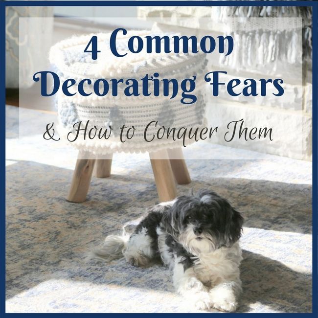
This is a true story in which decorating fears had to be conquered in order to get to a beautiful outcome. Last year I worked on a great room design with a wonderful couple who had recently built their dream home. They wanted a welcoming, comfortable gathering space for their active young family to hang out, watch movies, and entertain guests.
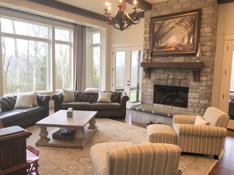
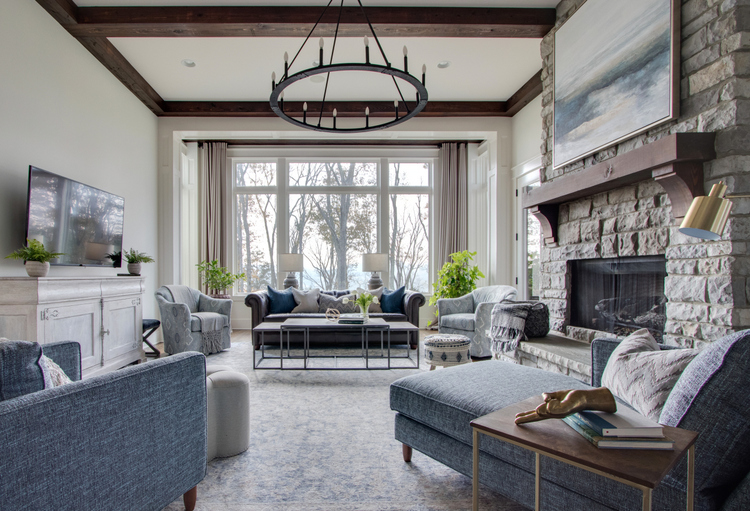
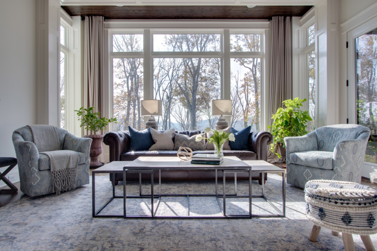
The architecture of the space was amazing! Tall ceilings, stained wood beams, stone fireplace, and a massive bank of windows showcasing a beautiful view. It was time that the furnishings matched the beauty of the architecture.

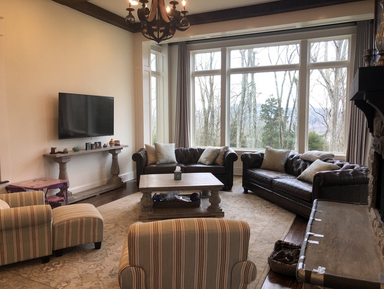
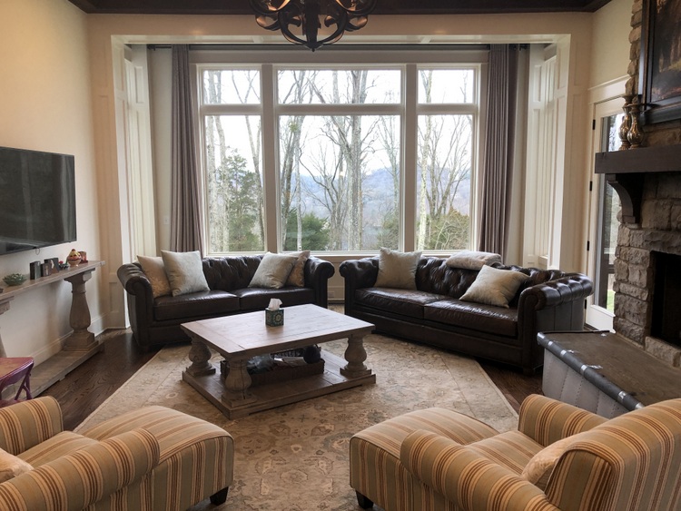
The Mr. really didn’t want to part with the brown leather sofa and loveseat, but the Mrs. wanted a significant transformation to take place in the room. This is when common decorating fears begin to show themselves in a design consultation.
Common Decorating Fear: Starting from scratch
The Mr. was afraid he would have to give up his favorite piece of furniture, while the Mrs. was fearful that she wouldn’t get the fresh, new look she hoped for if they didn’t start from scratch. Rather than throwing the baby out with the bath water, I offered a compromise:
Keep the larger brown leather sofa in the space, move the smaller loveseat to the library/office, and replace everything else.
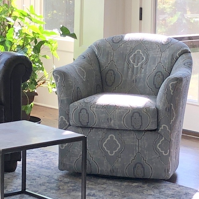
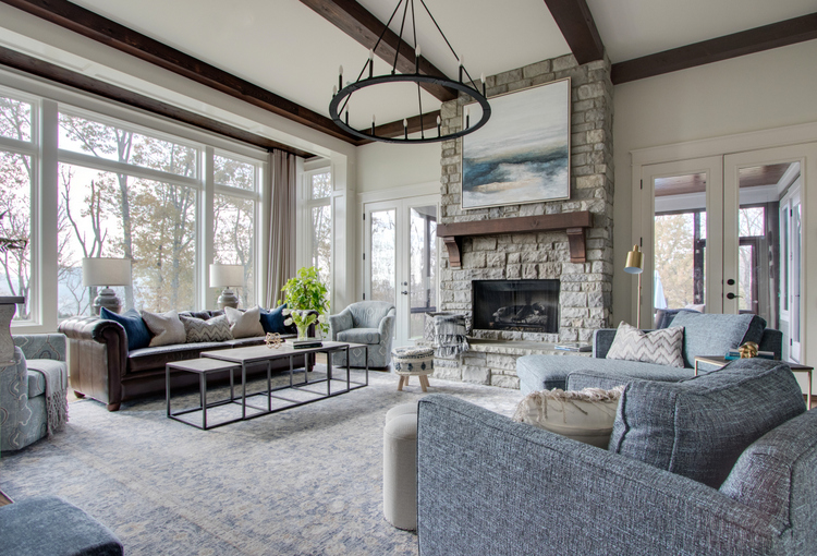
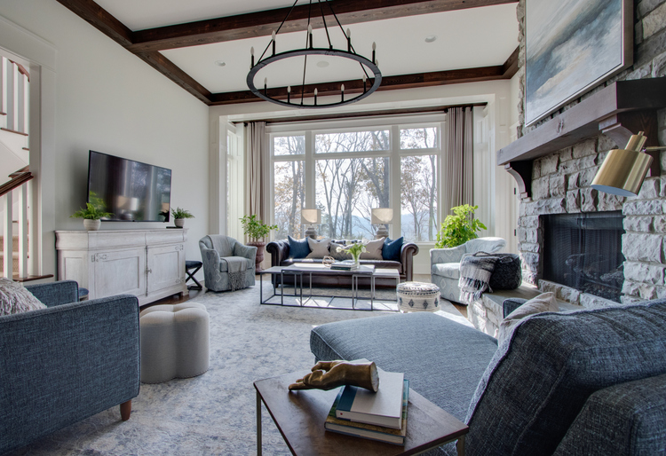
Sure, we’d need to lighten up that heavy sofa with some beautiful pillows. But first, we chose a pair of swivel chairs to flank the brown leather sofa, a beautiful chaise that would hold a snuggling pair watching a rom-com on Netflix, and an additional upholstered chair to balance things out. The most difficult choice to make was the upholstery for the new seating. Which brings me to the next common decorating fear:
Common Decorating Fear: Too much color
The popularity of neutrals has given rise to an unreasonable fear of COLOR. Those who are afraid of committing to color often end up committing to neutrals, which may result in a bland and lifeless interior. Adding color isn’t as risky as you may think – as long as it’s a color you like. Or, choose blue or green to add in with your neutrals. Blues and greens are practically neutral themselves, as they work with pretty much anything. Plus, blues and greens are true naturals – they are the colors most seen in nature!
The Mr. was particularly concerned about adding color to this space, until I pointed out the blues and greens outside their bank of windows. We agreed that adding blues wouldn’t be scary at all – in fact, using darker blue opposite the dark brown leather sofa would help distribute visual weight in the room.
For this couple, there was also a real fear of pattern, as they didn’t want to detract from the architecture and exterior views of the room. Time to conquer another common decorating fear . . .
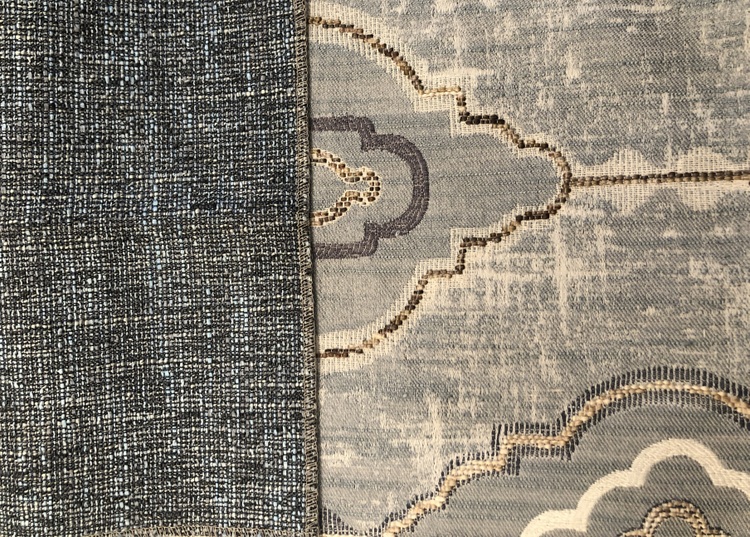
Common Decorating Fear: Mixing patterns
Clients can get really overwhelmed with fabric choices, but that’s where I can help them make decisions that they will be happy with for many years to come. Mixing upholstery, rug, and pillow patterns can paralyze your decision-making if you don’t know what you are doing. I typically narrow down the options to a handful that I believe will work best in the space, and then we talk about where to use which pattern and why.
It’s important to view fabrics and patterns from across the room, from a distance, rather than inspecting them up close. Smaller patterns that you may think are busy in your hand may actually read like a solid when viewed from a few feet away. And those bolder patterns? They don’t seem bold at all from across the room.
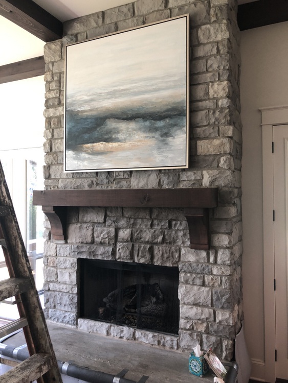
And don’t forget how art plays into the overall mix of color and pattern. The art previously above the fireplace was replaced with this gorgeous piece to better complement the stone, and to lighten and brighten the beautiful focal point of the room.
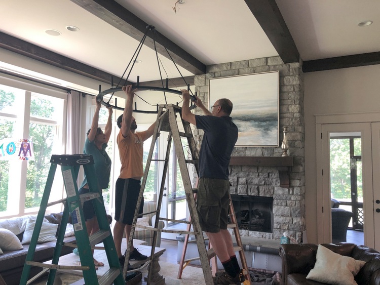
Common Decorating Fear: Getting the Scale Wrong
The previous hanging light fixture was too small for this large room. When I showed my clients a significantly larger fixture in a lighting gallery, they were scared that it was too large for their great room. Undersizing lighting is one of the most common mistakes homeowners make, but it doesn’t have to be that way. I’ve written articles here, here, and here that can help you make the right decision about the scale of your lighting in various situations.
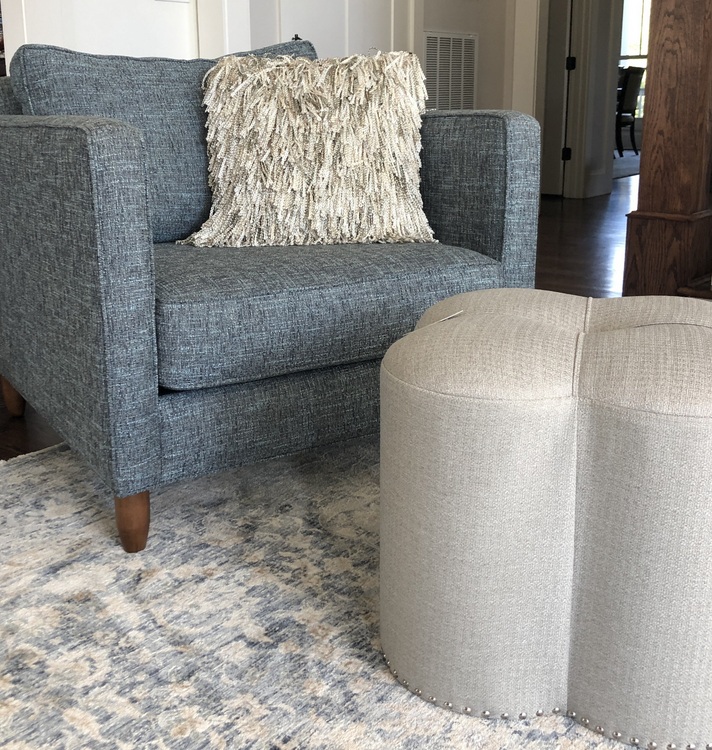
After the furniture arrived, I filled out the room with coordinating items, like this shapely ottoman, some fantastic pillows, and a few lovely lamps.
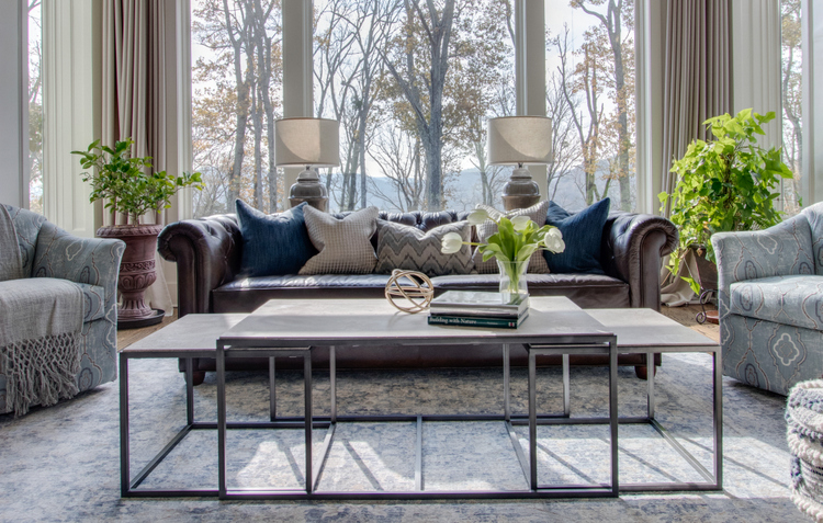
This coffee table is super-functional and impervious to wear and tear. Just pull the smaller pieces out for additional tabletops, footstools, or even additional seating.
Ultimately, both the Mr. and the Mrs. overcame their decorating fears, and the result is nothing to be afraid of!
Let’s check out the befores and afters:
 before
 design by The Decorologist
 before
 design by The Decorologist
 before
 design by The Decorologist
I hope you enjoyed this transformation of my clients’ great room! If you need help overcoming your decorating fears, schedule an appointment with me today.
If you want to overcome your fear of COLOR, the cure is definitely my in-depth online Psychological Color Expert™ training program! Find out how you can become a certified expert in all things paint color:


Gorgeous transformation!
Thank you, Roxanne! I had a beautiful foundation to work with.
I had all of these fears & then you worked your magic! Still enjoying all of the colors you helped me embrace.
You are so kind! I’m so glad you are still enjoying your beautiful, special home.
So, SO much better-
Beautiful design, friend!
Thank you so much, Elizabeth! There’s so much to love about this beautifully built home. 🙂
This is fabulous! Such a fantastic improvement, and I love how you detailed out the fears and how to move past them.
PS: I’ve missed seeing your posts this year! Please keep them coming. Even tiny ones. Each of them is like a vacation for me, since we’re still quarantining due to a compromised immune system in the family.
Thank you, Corrie. I am trying to be more consistent with the blogging – and I appreciate you saying even short ones are ok. I’m glad you enjoy receiving them! 🙂
I second that! The short ones are okay with me too and miss seeing your posts.
Thanks for letting me know, Jessica!
Beautiful Kristie, it blends so well, perfect color palette and is so welcoming!
Thank you, Cheri!
Beautiful transformation and I love the color. It still feels light, more open and neutral to me!
Thank you, Erin! I definitely think blues and greens are neutrals. 😉
Pretty close to perfection.
Thanks, Darby. 🙂
This is absolutely gorgeous. Fantastic job. Love everything about it!!
Thanks, Jennifer. We are all pleased with how it came out!
Beautiful, Kristie! Can you please share the brand of the coffee table?
Looks like Bassett
love it!
Kristie, your work is beautiful. I love the patterns and colors you used in this project. I am so thankful you helped us make our house a home, and I hope to work with you again in the future.
You hit this one out of the park, Kristie! And I think I’m going to use a similar light in the house we are building that has a vaulted ceiling! Love it!
You did a beautiful job, Kristie. The room looks much bigger, is very serene, and really showcases the view out those windows. I suspect that blue is the color color-averse men are most likely to accept.
Thank you, Kay. You are absolutely correct – blue is the #1 favorite color for most men (and women, for that matter)!
Now that’s just beautiful!! I do believe you worked magic in that room!
Wow, thank you for that compliment, Rhonda!
Kristi, you always create beautiful living spaces. This transformation is on point. Love, love, your work. Your didn’t say anything about the wall color. Did you repaint the room, or is the difference in appearance on the wall the reflecting of the light and color change in furnishings?
Thank you so much, Cheryl. Actually, we did not change the wall color!
WOW! It’s beautiful! And what a difference!
Thank you!
Beautiful!! Your work never ceases to amaze me!
Thank you so much, Louanne! xo
Lovely&fresh! Suits my personal taste as well. Congratulations Kristie, very well done!
Thank you, glad you like!
Holy smokes, Kristie! Stunning transformation! This should probably be on your resume: Can Work With Husbands 😀
Beautiful results, Kristie! I absolutely love the color scheme! May I ask what the wall color is?
Thanks, Deb! Actually, I did not change or choose the wall color. Not sure what it is.
Love your style.Great transformation.Love Your “use what you have” approach to decorating.Thanks for sharing 👍❤️
Thanks, Renee. I love to integrate what my client already has whenever possible – and especially when budget is an issue. 🙂
That room is super lovely now! Wow!
Thank you very much, Roberta!
Wow. What a beautiful transformation! You are so right about these 4 common decorating fears. I see them daily on the internet. Bland, boring, matchy-matchy and the wrong size are what most people seem to be able to accomplish for themselves. It’s such a shame because they often spend a lot of $$$. Kristie, you are a very talented designer and I love that you appreciate vintage and architectural integrity and charm, which are things that have gone by the wayside these days, but they are often the aspects I find most beautiful.
Thank you for taking the time to leave this comment and to give me such a wonderful complement.:) I have been known to talk people OUT of getting rid of things (whether furniture or actual architecture). New is not always better – especially when it comes to quality. Thanks again and have a great weekend!
I’m so glad you wrote this blog as I just emailed you about this room from your website last week because I’m going through agony trying to pick lighting for our new home. I love this room so much! We have an open floor plan family room and kitchen so I’m trying to figure this out. I love this type of large wagon wheel light and have had it in my cart for so long. I’m just afraid it’ll look weird because of the height of the light. Though we have 11′ ceilings, I’m afraid it’ll hang too low since the one I love most from Shades of Light has an overall height minimum of 45.5″. Can you address how to decide based on size and how low a main room chandelier should hang? I can find info on the web about heights pendants should hang or dining room chandeliers, but not main room lighting. Thanks!!
Hi Michelle,
The bottom of that sized fixture would be 7 feet from the floor, which would be fine for anyone to walk beneath – but I think 8 feet from the floor would look better for an 11 foot ceiling. If you intend to have a coffee table beneath the fixture, you can hang a bit lower. In that case, 7 feet from floor would be fine. Here are some articles I’ve written about lighting size that may help!
https://thedecorologist.com/overhead-lighting/
https://thedecorologist.com/what-size-light-fixture/
Beautiful transformation!
Thank you, Cindy!
Love this transformation and you nailed the big fears!
Thank you, Audrey! Another fun project for me. 🙂
The room had great bones and you brought it to life with the furniture layout, colors, and textures you used. Absolutely beautiful!
Thank you, Tammie. It really does have amazing architecture – what a joy to work in this space!
Kristie! That room now makes me want to walk in there and just breathe, while sitting on the chaise in the corner.
Though. I am, as you know, graduated from your color course, I will still be calling you to help me with my own RE-design of my house here in Florida. My fear is the spending part!
I have some serious regrets after Neil passed of selling some beautiful pieces I had.
But God will provide…….
Your ability to gracefully persuade people to think about color and change their perspectives is part of your genius, I think.
Right away I noticed the title of your post:
“….. decorating fears. “You did not say the word “mistakes”. That was so much kinder.
Love, Paula.