Last week, I got the best birthday present a girl like me could get – the cover of This Old House magazine! I knew my home would be featured in the Color Issue, but I didn’t know one of the rooms would make the cover.

And I wasn’t the only one that was beyond thrilled. You see, this is my 12-year-old daughter’s room. And when we began transforming what was Mr. Man’s office into her bedroom, we had some debates about the color scheme. She wanted turquoise on the walls, but I knew that strong color would be fabulous on the wall of built-in bookcases that are the focal point of the room.
She thought they should be white, because “most people paint their bookcases white.”
Tsk, tsk, little girl. Let’s not be like everyone else. The Decorologist overruled, and the bookcases, door, and trim went Benjamin Moore’s Azure Blue. The walls are Benjamin Moore Palladian Blue.
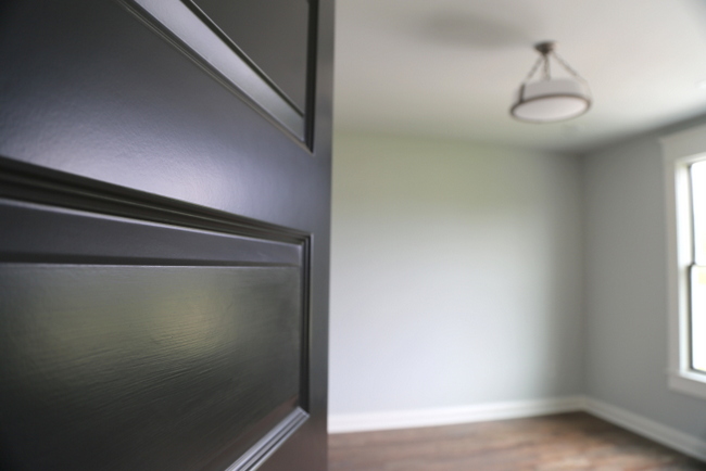
And lest you think our home is perfection, here is the state of the room the day the This Old House magazine feature was delivered to our door:
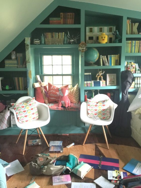
Ahh, such is real life. The writer did a great job with the feature, and this is the second time our home has been photographed by Gridley & Graves for a magazine. They have photographed so many amazing historic homes, so it was an honor to work with them again!
Gridley + Graves photography, from This Old House website
After having my work featured in 10 magazines now (wow, still can’t believe that!), I’ve learned a number of things about photo styling and photo editing of magazine shoots. The image below shows a shot I took two years ago on the left, and the shot that made the magazine on the right.
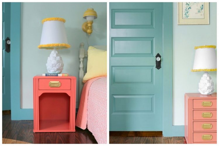
left – The Decorologist, right – Gridley + Graves
The bedside table was altered during the photo edit stage – wow, I wish it had that many drawers! You’ll also notice the difference between the paint colors. I painted this side table in Sherwin-Williams Coral Reef, which was SW’s 2016 Color of the Year. I’d say the true color of that piece is somewhat in between the colors you see above. Another important reason to test paint colors in your own home, rather than copying them straight out of a magazine!
This was a first for me in two ways – my work featured on the cover of a national magazine, plus a photo of my family on the interior:
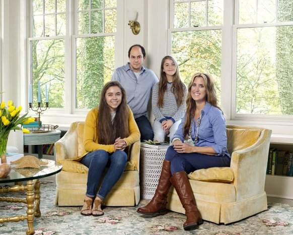
photo by Gridley + Graves in This Old House
But, do you want to know the MOST EXCITING part of all of this? The cover is a downloadable coloring page on This Old House’s website!!!! Can you imagine how stoked my 12-year-old was about her room being transformed into an honest-to-goodness coloring page???
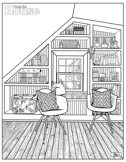
Download your own here from This Old House magazine and color it in YOUR favorite colors for a chance to win my Just the Right Paint Color workshop video!!! I’m giving away 3 for the prettiest pictures, colored by you or your little one.
You can either post a photo of your coloring page in the comments below, or go to The Decorologist Facebook page and submit your photo in the comments about the contest.
Make sure to pick up a copy of the 2016 Color Issue of This Old House and see the 8-page feature of our home!


So proud of you, Kristie! I have followed your blog for so long I feel like I know you. Congratulations!!
Thank you so much, MK!!! I always appreciate your comments 🙂
Congratulations! I’ve long admired your home’s interior, however, I never knew what the outside was like. You have a beautiful home, inside and out; what a lovely family, as well. Congrats again.
Awww, thank you so much, Joanne!
I saw the magazine and was blown away! Congratulations! You deserve to be on the cover. The article was also very nice.
Susie, thanks so much dear!!!
congrats, Kristie!
Thank you 🙂
Congratulations, Kristie! How exciting for you and your daughter! Love the unstaged photo of her room, too. You have a beautiful family. Thank you for sharing your success and for always keeping it real! By the way, I have learned so much about color from reading your blog, and the guidance you provide helped me to choose colors that I am over the moon happy with in my new home! Thank you!
I’m so glad to hear that, Laura!!! I’d love to know some of the paint colors you have used in your home 🙂
Hi Kristie, Thank you for asking! Our new home had just been painted by the seller, but a few areas were not to my taste. For now, I kept the neutrals and changed the color in some of the accent areas where she had faux finishes, and added color to one bedroom. Here you go:
For tray ceilings in dining room and foyer:
Sherwin Williams
Celestial Skies HGSW1396
I had this painted in the uppermost part and it makes me so happy every time I look at it! The ceilings are very high and all the trim is super white.
For two cutouts/nooks near entry:
Sherwin Williams
Amaryllis SW6591 also 106-C3
also known as HGSW1055-strip 105B
I think the painter thought I was nuts choosing this color, but when it was done and my furniture and decor was placed in front, he really seemed to like it. Since then I have added a lovely vintage mirror with gold paint, and the colors work beautifully together. I am so glad to finally be unpacking my treasures and making this place feel like home!
For my daughter’s bedroom:
Benjamin Moore Iris bliss 1383
We added color and also skim coated the walls. We are not used to orange peel texture and she is so happy to have this lovely, soothing color on smooth walls!
Thank you for all of your wonderful blog posts! I am finding them helpful in decorating my new style of home, which is very different from the traditional I owned for most of my adult life!
Wow, congratulations, Kristie! Well deserved spot on the magazine and what a great idea for the coloring page! You all should be very proud of your accomplishments & your lovely home!
You are very kind, Maria, thank you!!
congratulations! so exciting!
Thank you, Karen!
Congratulations Kristie!
You deserve all this and more!
Blessings for continued success
Thank you so much, Julie! Would love to catch up with you sometime 🙂
So thrilled for you…. and your beautiful family. I am sure they are very proud of you ! You have earned bragging rights with all of the hard work you have done !
Enjoy and celebrate. ??
You are always so sweet, Mary! Thank you so much!!!!
So good, so cool, so deserved, so Mr. Man looking comfortable :), so beautiful the Southern Ladies, so much style it makes you want to sing out loud, so good is that team you have- both employee and family,so missing are the mint juleps- never had those—- so tired you must be yet so pleased with your efforts———BRAVO and congratulations—to all of you.
Haha, we have laughed at our house about how uncomfortable Mr. Man appears – in fact, he looks downright irritated!!! 😉 I’ve never had mint juleps either, Kathleen, but it does sound nice! Thank you!
COOOOL! What an inspiration! Well done Kristi!
Thank you, Max!
What a lovely family, what a lovely house! How fun is that? Congrats!
Thank you, Pat!
Oh Kristie!!!! Congratulations to you and your daughter!!!! What a stunning room and a most beautiful family!!!! Thank you soooooo much for all you so freely imparting your gift to others, knowing that it certainly comes at a cost to you and your family and we are the more blessed! Congratulations on your many successes and I am honored to have followed you over the years!! Wishing you ALL the BEST!!!!
PS – I have a daughter, who teaches music in an inner city school for special needs. She has been making every effort to reach these kids and could use some help to make her room inspiring, if you would be up for the challenge!
Thank you so much for saying that, Sylvia! I appreciate your kind words and that you care to follow over time – it means a lot to me!
Congratulations! Your family is also beautiful. Thank you for all the inspiration. Blessings
I am so excited for you! Congrats on your MANY successes. You’re an inspiration!
Wow! Just SO wow!
Yep, we are all kinds of excited at my house right now 😉
Congrats Kristie! Love all you do. You are so talented and original. Love all your posts.
Aww, thank you Ann!!!
Oh my goodness!!!!! Woohoo for you! Super exciting for your daughter as well. The colors are cheerful and your fam pic makes it personal. Congrats to you and yours. Keep sharing and helping us all to create a home we look forward to walking into everyday.
Oh, thank you so much, Robin! Your encouragement means so much to me 🙂
Love these photos and the story! Congratulations to you Kristie!
While I’m on here I wonder if you can point me toward one of your old posts. I’m looking for the one where you talked about mixing hardware colors. I’m doing a whole house remodel of a 1930s house. i want to use two colors of hardware and am trying to find your suggestions but can’t anywhere! Thanks!
I don’t know the specific post, but here are some pointers: iron and nickel work well together, as do gold and old-rubbed bronze. More recently, I have found that the new gold and black look smashing together! Hope that helps, LW 🙂
Wonderful Kristie! Such a beautiful room and such a beautiful family. A huge congratulations!
That’s awesome!!! So proud of you! I love your blog and have followed it for your timeless advice after finding you by googling ideas for a LHOTP party for my daughter years ago. Your ideas are great. Congratulations!!
Kristie, Congratulations. You deserve the cover! What a beautiful room! I am sure your daughter is so pleased too. I love the coloring page idea! So happy for all of you. Many Blessings for your continued success!
Wow! Congrats. I can’t wait to see the magazine. Your photos of the shoot from 2 years ago was really eye-opening. I wouldn’t have guessed that already beautiful rooms get photoshopped, just like supermodels. Extra drawers aside, I think your original looks better. They made they side table and lamp too small!
Judy,
Nothing is as it appears, I suppose! I don’t think they altered the size of the table or lamp – it is probably more a difference in the angle of the shot that they took compared to mine. Thanks for your comment, Judy!
Congratulations! Your insight and fresh approach on affordable design and COLOR make your blog and newsletter worth reading. Keep up the good work!
Oh wow, Nancy, thank you so much! It means a lot to hear that!!!
Congrats! Now I’ll have to pick up that magazine ASAP! 🙂 Great job – as always – but so nice to be recognized, all the same, I’m sure! 🙂
Thank you, Elayne – I would have never believed you if you told me 10 years ago my work would be on the cover of This Old House!
How fabulous and exciting for you and your daughter! Congratulations!
Thanks, Priscilla! Did you recognize the living room color?
The editors at TOH have excellent taste. And the coloring page is awesome.
Aww, thanks so much Molly!
That’s so wonderful Kristie!! I love the way TOH is always tasteful, original, and yet accessible — and your house fits their target perfectly! I, too, have an old house (230 years), and I’m always referencing them on how to “young-up” a home while tuning in to its history.
Wow, 230 years old??? That’s amazing to live in a piece of history like that, Amy! Thank you so much for the complements 🙂
I subscribe to This Old House magazine. At first I didn’t realize the cover was your house, then I opened it up and remembered that photo shoot. Looks lovely, and a nice family photo and article, but not quite the house I know from your blog. So did they hide or change out most of your found portraits? I love those so much and they bring such life to your rooms. And the color in your bedroom looks totally washed out.
Being a photographer, I knew that they tweak saturation. exposure and other normal photo manipulations, as well as stage and set up photos that don’t always look like they do in real life, and take timed exposures with natural light to make everything look lighter and to blow out the window views, but I had no idea that a piece of furniture would be Photoshopped too. I think that is taking things too far, and the original is perfect as it is.
Maybe they are selling an ideal, but I would prefer more reality to this virtual image of perfection that saturates our media. First models weren’t pretty enough as they were, now houses and even pieces of furniture aren’t either. So what is next–virtually adding in some accessories from their advertisers? Adding a window to balance the facade? Where does it end?
Now we don’t just have body shame, we have house shame too, because there isn’t a way most people can reach that ideal. Once thing I appreciate about your blog is that you do show real houses and practical ways to tweak what you have to make it more functional and to look better. And we all know how long it has taken for you to achieve the home you have, and its defects. Thanks for keeping it real.
Thank you for your thoughtful comments, Kathy. When they first planned the photoshoot, they let me know that my house was a little “too decorated” for their magazine. They have a high percentage of male viewers and were concerned about many of the more feminine collections and colors in the home. My portraits had to come down – you are correct! They told me they really wanted to feature the architecture of old homes, not so much the decor. For this particular article, they really wanted to focus on the paint colors, which they did. Another thing to consider is that I do move my things around constantly, so some of the differences might have been just that. Paint colors are almost never dead-on in print, so if you walked into my home today you’d see my house is probably not as bright as you’d expect after seeing some of the photos (I think, anyway!).
I must say, they were meticulous about crediting items in the house properly and they brought in ZERO props beyond florals. They may have changed around a few pieces of art, but nothing too concerning to me.
However, one home I designed was featured in a different magazine last year where they completely dismantled all the small decor in my client’s home and replaced with their props. Honestly, it looked like someone else’s home altogether, and yes, they added accessories that they could advertise in the magazine. This Old House did NOT do that.
So, I suppose it all depends on the focus of a given magazine or the slant they want to give on an article. I’m getting thicker-skinned, so it doesn’t bother me as much anymore. But I do like to keep it real and share some of those true details, because I am NOT living a perfect magazine life. Heck, I don’t think anyone is. But everyone wants to see “pretty” pictures, don’t they?
Yes we all like pretty pictures, and I think that photo would have been just as pretty without adding drawers to the bedside table or changing the color. Staging is one thing–creating a false digital-only reality is another.
Personally, I would have preferred to have seen a photo of your bathroom in that spot in the layout–it is largely original and was color inspiration for the ground floor of your house. That inspiration was featured prominently in the article, and so should have been shown in the photographs. I follow your blog so I know what it looks like, but if I didn’t I would wonder, “What bathroom?” Besides, it would be a nice contrast to all those shows where people smash up mid-century bathrooms that dare to have some color to them, and perhaps inspire some of their readers to follow your lead and work with the existing finishes.
I could tell they used your own things and that it isn’t too far from what you might have done, so I think that is fair. At least one found portrait could have been included to show your whimsical side without alienating male readers I think. But if a magazine uses a house like a stage or movie set, and makes it nearly unrecognizable with new furniture and accessories, like they did for in your client’s home, then they shouldn’t write it up as if that is what that person’s house actually looks like, or as an example of your design work.
There is a movement for digitally altered photos of models to be labeled as such, and perhaps the same should be done for homes! I expect more from a magazine like “This Old House,” which is supposed to provide real-life advice and inspiration for owners of old houses, not digital fantasies.
So amazing! You are a terribly talented gal for sure, and am glad to see you receive the recognition you deserve!
Thank you so much for your encouragement, Leigh!!!
I too, receive this magazine in the mail and at first didn’t recognize it as your home … and then the next day as I was opening the magazine I thought, “this looks familiar …” ! Congratulations!!!
Love your daughters bedroom!
Michelle, this is Kristie’s social media manager, Shannon Can you send a message to [email protected] – you were one of the winners of her Just the Right Color video workshop. Thanks!!
Can you please tell me the name of the fabric on the tulip pillows? thank you!